Prototyping, Wireframes & Evaluations
Once our team had thoroughly defined the HIKEO experience from the top-down and redesigned many iterations of the experience, we had finally arrived at the point of the project to create and prototype the experience. For this stage in our project, we created low-fidelity wireframes using Balsamiq. The wireframes were made into interactive models of HIKEO’s mobile application so that when we could seamlessly use the prototypes in our evaluation process as well. The main purpose of developing these HIKEO prototypes were so that when we used them for the evaluation process, it could help facilitate discussion and garner user insights before any code or technical development work had to be done.
At the beginning, when our team first came up with the idea of HIKEO, we initially wanted to just leap to this stage of the development design process but luckily, by going through all the various design stages first, our team was able to develop HIKEO with a much richer and well-developed sense of context. In creating the mockup for the user-interface of HIKEO, we focused on creating the mobile application interface with as much detail as possible. Aside from the digital sketches we generated with Balsamiq, we also created the “scripts” and additional screen visuals (i.e. maps, icons, toggle signals, etc.) that would aid the lo-fi mockup in becoming more realistic and aligned with what we envision HIKEO would ultimately be like.
For our evaluation process…
We used our low fidelity wireframes from our prototyping stage and asked local hikers to go through these wireframes alongside our team members. The wireframes we created were not very interactive and had static content. However, we wanted to gauge reactions to the features and the workflow that hikers would go through if they were to use our app. We also wanted to see how effectively our users would be able to take in and process the various features as well as which of the features would be particularly helpful or useless to them during their hiking planning process.
We took a random sample of people who identified as hikers in the Pacific Northwest and ran the evaluation process one person at a time. We conducted each evaluation in two stages:
The first stage we asked the participants to go over the wireframes in a PDF format. We asked them to spend at least 30 seconds one each page and let us know of their initial impressions. We used a few elements from role-playing and sketch design methods to establish context, by asking the participants to imagine they were planning for a hike during the Memorial Day (long) weekend, and then let them know that this was an app that could help with their planning. With this intent set, we asked them to review each page and talk aloud what they thought of the sections and the elements within each wireframe.
In the second stage, we took them through the wireframes step by step explaining what the elements were and then asked them what they thought once they had a better understanding of what each section was meant for, in the context of how it can help piece together their planning. The reason we did the second stage was because we were using low fidelity models. While we tried to add in some informational layer to the wireframes, the experience is not the same as with a high-fidelity one where icons, contextual help text, and colors can help distinguish better patterns. We wanted to understand and contrast what it was like for a user to first look at the application design and then whether having a better context helped change or augment their perspective. This exercise also helped us gain some insights into the kind of information layer required for the application.
In addition to their insights and feedback, we also did random sampled interviews with other hikers in the area so that we could learn and gain more perspective in how they viewed our concept, and whether such a service and product would help them in their hiking process. These quick evaluations of the application and concept overviews were conducted by showing the individuals our video and talking them through the main aspects of the wireframes to give an idea of how HIKEO would function and look like. We were able to capture their initial reactions and learn a lot from their snap feedback on how HIKEO could work better for them and others like them (i.e. family, friends, peers, etc).
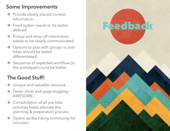
Through the entirety of the prototyping and evaluation process, we were constantly receiving feedback and ideas on ways to continue to improve HIKEO. By running our recruited, would-be HIKEO users through the experience prototype in as immersive a way as possible, we were able to facilitate an as-real-as-possible mock experience to garner rich participant insights that could only help us refine HIKEO in further design iterations.
For more details or information regarding HIKEO’s prototype & evaluation process or related materials, please reach out directly to me through the Contact page.


